Ten Best Strategies for Creating Truly Inclusive Experiences
Summarize with:
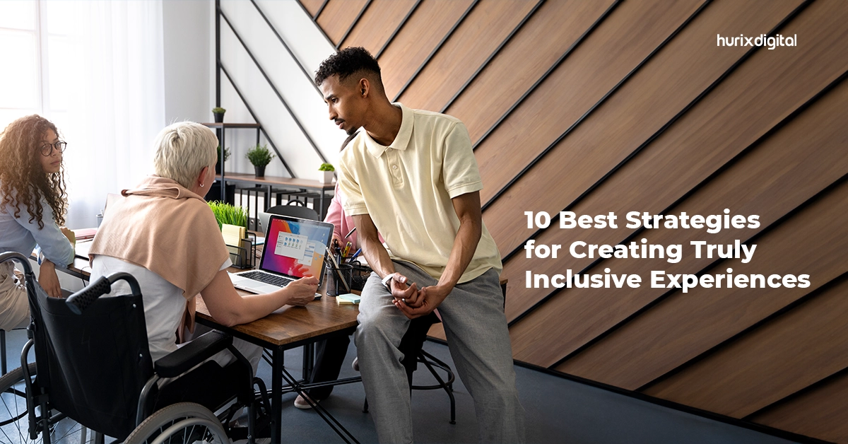
Inclusive design is moving beyond simply checking accessibility boxes and towards a fundamental shift in how products, services, and environments are created. It is about recognizing that diversity is not an afterthought but the very fabric of the human experience.
The World Health Organization reports that roughly 15% of the global population lives with a disability. Failing to consider the needs of this vast potential market represented by individuals living with disabilities translates to missed opportunities for businesses.
This philosophy goes beyond accommodating disabilities. It encompasses age, gender, and cultural background.
Research by The Big Hack highlights a stark digital divide: in online spaces, individuals with disabilities encounter accessibility barriers more than 50% more frequently than their non-disabled counterparts. This disparity underscores the need for inclusive design strategies and principles that dismantle obstacles and create universally accessible experiences.
The Return on Disability Group found companies prioritizing accessibility outperform their peers, proving it is not just the right thing to do but a clever business strategy.
Table of Contents:
- Top Ten Inclusive Design Strategies
1. Design For A Spectrum of Users, Not a Stereotype
2. Ensure Alignment With Fundamental Guidelines
3. Deep User Research
4. Responsive Design That Adjusts to Users’ Requirements
5. Be Purposeful In Your Color Choices
6. Provide Alt Text For Images
7. Streamline Page Loading and Minimize Wait Times
8. Incorporate Inclusive Facets
9. Think Beyond Data
10. Adopt a Multi-Format Approach - Conclusion
Top Ten Inclusive Design Strategies
Listed below are some actionable practices and inclusive design strategies for shaping experiences that resonate with all.
1. Design For A Spectrum of Users, Not a Stereotype
Many designers fall into the trap of crafting products for their ideal selves—someone familiar with the ins and outs, adept at navigating menus, and perhaps overlooking user experience inclusivity in testing. Real users come in all shapes, sizes, and abilities, and true inclusivity demands casting a wider net.
Challenge your assumptions right from the get-go. Ask yourself:
- Sensory Access: What happens when sound is absent? Can users decipher information visually alone?
- Assistive Technology: How does the experience translate for someone using a screen reader, voice control, or specialized hardware?
- Physical Limitations: Can users with dexterity issues interact with touchscreens, buttons, or keyboards? Are font size and spacing optimized for varying eyesight?
- Diverse Needs: Are you factoring in cultural differences, cognitive abilities, and unexpected scenarios that might disrupt typical user flows?
2. Ensure Alignment With Fundamental Guidelines
While accessibility guidelines like WCAG offer invaluable technical guidance, to encourage user experience inclusivity, we must shift towards a principle-based approach that fosters empathy, understanding, and proactive problem-solving.
Recognize that your biases and assumptions, however unintentional, can limit your perspective. Instead, let the four pillars of WCAG become your guiding light:
- Perceivable: Information and interfaces must be accessible to everyone, regardless of their sensory abilities.
- Operable: Interactions and controls should be usable by everyone, with or without assistive technologies.
- Understandable: Content and user flows should be clear, logical, and consistent. Avoid jargon, complex layouts, and ambiguous language. Clarity benefits everyone, not just those with cognitive challenges.
- Robust: Design for flexibility and compatibility. Your solutions should work across different devices, browsers, and assistive technologies, ensuring no one is left behind.
Also Read: How Can Your Business Comply with WCAG 2.2 Seamlessly?
3. Deep User Research
Accessibility in design is about understanding the lived experiences of individuals beyond stereotypical personas. While user research is crucial, relying solely on predefined personas can restrict your vision and create blind spots, leading to solutions that miss the mark for real users.
Go beyond surveys and focus groups to delve into the lived experiences of your target audience. Here is how:
- One-on-one Interviews: Engage in open-ended conversations to understand user motivations, challenges, and preferred ways of interacting with your product or service.
- Contextual Inquiries: Observe users in their natural environments, whether it is their home, workplace, or public space, to see how they interact with similar products or navigate similar tasks.
- Accessibility Audits: Identify potential barriers for users with diverse abilities, including visual, auditory, motor, and cognitive limitations.
4. Responsive Design That Adjusts to Users’ Requirements
Creating inclusive environments and equitable interaction for a broader user base by ensuring websites and applications seamlessly adapt to diverse screen sizes and devices is paramount.
A prime example lies in mobile banking apps. Implementing responsive principles guarantees accessibility in design for users with dexterity limitations. Buttons and text fields become generously sized for accurate finger taps, eliminating frustration and promoting efficient navigation.
Responsive layouts enhance content readability across screens, benefiting users with low vision or cognitive challenges. These inclusive design strategies translate to a user-friendly experience for everyone, regardless of their preferred platform or visual abilities.
5. Be Purposeful In Your Color Choices
Color can be a powerful tool for visual communication, but relying solely on it can create unintentional barriers for users with color blindness, low vision, or other visual impairments. Here are some practices to keep in mind:
- Prioritize Contrast: Ensure sufficient contrast between foreground elements (text, icons) and background colors. Aim for a minimum ratio of 4:1 for accessibility, or go bolder for greater impact. Good contrast benefits everyone, not just users with visual impairments.
- Redundant Cues: Do not rely solely on color to convey meaning. Supplement color with additional cues like underlining links, adding descriptive text labels, or using distinct textures in charts and graphics. This creates redundancy and ensures accessibility in design, even if color perception is compromised.
- Beyond Color Codes: Avoid phrases like “click the green button” or “look for the red X.” Consider how the information would be perceived if the color were removed altogether. If it becomes ambiguous or inaccessible, rethink your design choices.
6. Provide Alt Text For Images
Images enrich our digital experiences, but they can become impenetrable walls for users with visual impairments. While captivating visuals enhance the user experience, relying solely on them can inadvertently exclude individuals with visual impairments who rely on screen readers. To bridge this gap and embrace accessibility in design, providing concise and accurate alternative text (alt text) for all images is paramount.
Alt text is a critical information avenue, empowering visually impaired users to grasp the context, purpose, and essential details conveyed by the image. Concise yet informative, it should accurately describe the image content, avoiding redundancy with the surrounding text.
7. Streamline Page Loading and Minimize Wait Times
Lightning-fast website load times are imperative for creating inclusive environments. When pages crawl to a standstill, we alienate not just impatient users but also those with limited bandwidth or slower connections. Every millisecond counts for individuals in remote areas, those on data plans, or simply navigating internet limitations.
Prioritizing website performance bridges the digital divide. Optimizing images, streamlining code, and implementing caching mechanisms enable user experience inclusivity. Regardless of their internet conditions, users may experience your design without the frustration of endless loading screens.
8. Incorporate Inclusive Facets
When you truly understand your users’ diverse needs and desires, you discover unexpected ways to delight them. These examples highlight the power of exploring non-traditional facets in your inclusive design strategies.
For example, by moving beyond conventional search criteria, like hair color or skin type, Pinterest embraced the spectrum of hair textures and styles within its user base. This seemingly “minor” addition empowered users to discover content that resonates with their unique identities, creating inclusive environments while browsing.
9. Think Beyond Data
While data is an invaluable tool for understanding user behavior and informing design decisions, it is crucial to avoid falling into the trap of data determinism. Accessibility in design thrives not just on insights from data but also on empathy, diversity, and critical thinking.
Often, data is not neutral; it reflects the biases and perspectives of those who collect and interpret it. It makes diverse design teams, built with user experience inclusivity at their core, essential. When different viewpoints are represented, data is challenged, questioned, and used more responsibly.
10. Adopt a Multi-Format Approach
Move beyond a checklist of formats and embrace a holistic approach to content accessibility to empower every voice to access, understand, and engage with our creations. A layout optimized for multiple screen sizes caters to individuals utilizing smartphones, tablets, and desktops, seamlessly accommodating their preferred devices.
Providing written content in plain text is a commendable first step, but the journey does not end there. Think beyond PDFs and consider alternative formats like:
- Audio Recordings: These cater to auditory learners and those with visual impairments.
- Videos with Closed Captions and Transcripts: reach individuals with hearing impairments and diverse learning styles.
- Interactive Learning Modules: engage kinesthetic learners and provide a dynamic experience.
- Tactile Representations: benefit individuals with visual or cognitive disabilities.
Offering multilingual options caters to non-native speakers, while dyslexia-friendly fonts and layouts create a smoother reading experience for some.
Do not limit users to a single format. Offer a menu of options, empowering them to choose the experience that resonates most with them.
Also Read: Accessibility for Masses – Know How Hurix Digital Comes in
Conclusion
Beyond the ethical imperative, accessibility in design is a compelling business case for digital inclusion. Exclusionary design practices can damage brand reputation and hinder business growth.
Adopting inclusive design strategies that cater to the full spectrum of the human experience ensures no one is left behind. Early intervention and tackling accessibility hurdles during conceptualization are far easier than retrofitting solutions later.
Hurix Digital taps into the power of diverse formats, while its expertise in multilingual content creation ensures a user experience inclusivity that caters to every voice, every need, and every ability. Our platform elevates the user experience by combining award-winning inclusive design strategies with data-driven technology.
Reach out to us today for tailored digital solutions that ensure accessibility and drive change.
Summarize with:

Vice President – Content Transformation at HurixDigital, based in Chennai. With nearly 20 years in digital content, he leads large-scale transformation and accessibility initiatives. A frequent presenter (e.g., London Book Fair 2025), Gokulnath drives AI-powered publishing solutions and inclusive content strategies for global clients
 A Space for Thoughtful


