Avoid These Common Mistakes in PDF Accessibility and Remediation
Summary
Making PDFs accessible is crucial for everyone to access information equally. This guide provides simple tips for making your documents easier to read and use for all users, especially those with disabilities. You’ll find helpful advice on avoiding common mistakes, as well as best practices to follow to make sure your PDFs meet WCAG standards. Learn about the tools and guidelines that can assist you in creating more inclusive documents.
PDFs are a common and convenient way to share information online. But did you know that more than 90% of PDFs are at least partially inaccessible to people with disabilities?
This means they may appear as blank, blurry, or illegible code for individuals using assistive technologies such as screen readers, screen magnifiers, text-to-speech software, or Braille displays. This can create barriers to accessing and understanding the information in your PDFs and affect your legal compliance and reputation.
People using assistive technologies like screen readers can get lost and frustrated when they cannot access the information they need in PDFs. In such a scenario, PDF remediation helps transform your PDF into a smooth and navigable experience. However, the challenge lies in avoiding common pitfalls that hinder accessibility.
In this post, we’ll explore PDF accessibility and all the know-how you will need to create an inclusive and frustration-free experience. Read on!
Table of Contents:
- What is PDF Accessibility, and Why Does it Matter?
- How to Create Accessible PDFs from Different Sources?
- How to Test and Fix PDF Accessibility Issues?
- How to Figure Out if a PDF is Accessible in a Few Simple Steps?
- 7 PDF Accessibility Pitfalls to Avoid That Trip up Accessibility and Remediation
- Remediating an Inaccessible PDF
- Wrapping Up
What is PDF Accessibility, and Why Does it Matter?
PDF accessibility means that a PDF document can be accessed and read by everyone, including people with disabilities. It depends on the structure and features of the PDF file, as well as the software and devices used to view it. Some of the key elements of PDF accessibility are tags, form fields, image accessibility, and text-to-speech compatibility.
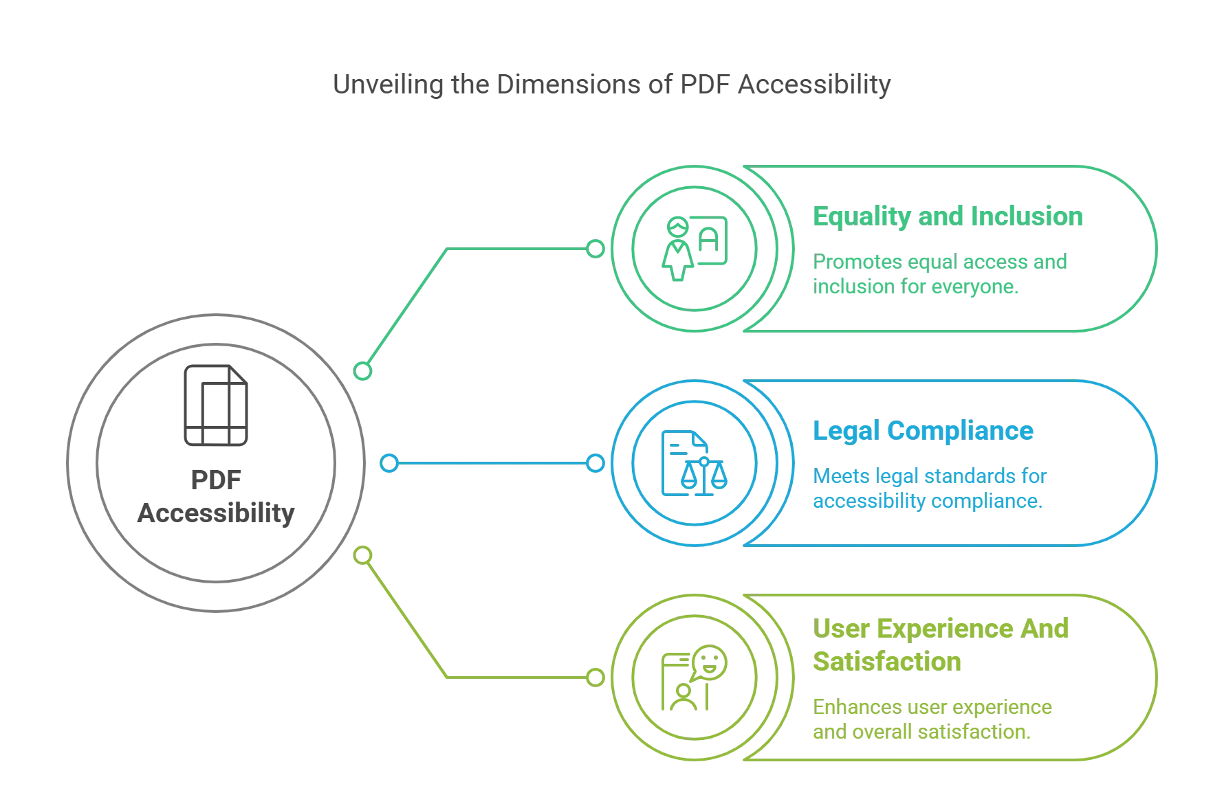
PDF accessibility matters for several reasons, such as:
1. Equality and Inclusion
PDF accessibility ensures that everyone can access and benefit from the information in your PDFs, regardless of their abilities or preferences. It promotes equality and inclusion for people with disabilities, who make up 16% of the world’s population.
2. Legal Compliance
PDF accessibility may be a legal requirement for your organization, depending on the type and location of your business. Various laws and regulations mandate digital accessibility, such as the Web Content Accessibility Guidelines (WCAG) 2.0, the PDF/UA standard, the European Accessibility Act (EAA), and Section 508 of the U.S. Rehabilitation Act.
Failing to comply with these PDF compliance standards and regulations can result in lawsuits, fines, and reputational damage.
3. User Experience And Satisfaction
PDF accessibility can improve the user experience and satisfaction of your PDFs, not only for people with disabilities but also for all users. For example, the tags, form fields, and image accessibility features that make your PDFs accessible also make them more readable, usable, and interactive for everyone. PDF accessibility can also enhance the SEO and performance of your PDFs, as well as the trust and loyalty of your users.

How to Create Accessible PDFs from Different Sources?
PDFs are typically created from other applications, such as Word, Google Docs, PowerPoint, or InDesign. The best way to create accessible PDFs is to start with an accessible source document and then convert it to a PDF using the right settings and tools.
Here are some PDF accessibility best practices and tips for creating accessible PDFs from different sources:
1. Start with an Accessible Source Document
- Ensure your source document has a clear and consistent structure, using headings, lists, tables, and other formatting features.
- Add alternative text for images, and use descriptive link text for hyperlinks.
- Use sufficient color contrast, font size, and style for your text.
- Set the document language and title, and use the accessibility checker tool in your application to identify and fix any issues.
2. Use the Right Settings and Tools to Convert to PDF
- When converting your source document to PDF, use settings and tools that preserve its tags and accessibility features. For example, you can use the Save as Adobe PDF option or the Acrobat tab to create a tagged PDF in Word.
- Avoid using the Print to PDF option, as it will remove your document’s tags and accessibility features.
- Make sure that you assign an alt text for the PDF’s name.
3. Review and Edit Your PDF
- After converting your source document to PDF, open it in Adobe Acrobat or Reader and review the tags, form fields, image accessibility, and text-to-speech compatibility of your PDF.
- You can use the Tags panel, the Form panel, the Accessibility panel, and the Read Out Loud feature to check and edit these elements.
- You can also use the Make Accessible action wizard to automate some of the steps for creating accessible PDFs, such as adding tags, form fields, and file properties.

How to Test and Fix PDF Accessibility Issues?
Even if you follow all the PDF accessibility tips, you may still encounter some accessibility issues in your PDFs. These issues may be caused by various factors, such as the quality and complexity of your source document, the conversion process, and settings, or the software and devices used to view your PDF.
Therefore, it is essential to test and fix the accessibility issues in your PDFs using some of the following tools and methods:
1. Use the Accessibility Checker Tool in Adobe Acrobat or Reader
The accessibility checker tool is a built-in feature in Adobe Acrobat or Reader that can help you test and fix accessibility issues in your PDFs. To use the accessibility checker tool:
- Go to Tools > Accessibility > Full Check, and select the options and standards you want to check.
- The tool will generate a report of the accessibility issues in your PDF, along with suggestions and solutions for fixing them.
- You can also use the accessibility checker tool to generate an accessibility report for your PDF, which you can save or print for reference.
2. Use Online PDF Testing Tools and Services
Various online tools and services can help you test and fix accessibility issues in your PDFs. Some are free, while others may require a subscription or fee.
Some examples of online PDF testing tools and services are PDF Accessibility Checker (PAC) and CommonLook PDF Validator.
3. Use Manual Testing Methods and Assistive Technologies
To test the accessibility of your PDFs, you should use automated tools and services, manual testing methods, and assistive technologies.
Manual testing methods and assistive technologies can help you evaluate the accessibility of your PDFs from the perspective of end users, especially those who use screen readers, screen magnifiers, text-to-speech software, or Braille displays.
Some examples of manual testing methods and assistive technologies are:
- Keyboard Testing: It involves using only the keyboard to navigate and interact with your PDF without using the mouse or touchpad.
- Screen Reader Testing: This involves using software or devices that can read aloud the text and elements in your PDF, such as NVDA, JAWS, VoiceOver, or TalkBack.
- Color Contrast Testing: This testing involves checking the contrast ratio between your PDF’s foreground and background colors, such as the text and images.
How to Figure Out if a PDF is Accessible in a Few Simple Steps?
1. Selecting Text
A straightforward yet effective method involves selecting or highlighting text using a mouse. If the entire page is selectable or if only fragments cannot be highlighted, it suggests an image file rather than accessible text. This intuitive technique offers a quick glimpse into the document’s underlying accessibility.
2. Tagged PDFs
Tags play a vital role as they identify the content type in the PDF and store associated attributes. Moreover, tags organize the document into a structured hierarchy. If a PDF lacks tags, it indicates inaccessibility. Open the PDF in Adobe Acrobat Pro or Acrobat DC to verify this. Navigate to the Tags panel on the left in the Navigation pane. Manually inspecting the tag tree in Adobe Acrobat Pro ensures correct heading levels and accurate element tagging. By selecting the Show/Hide option and navigating to Tags in the Navigation Panes, visually assess the tags in descending order. This step confirms the structural integrity of the document.
3. PDF Accessibility Testing Tools
You can check whether PDFs are accessible using different tools.
- Accessibility Full Check Tool: Adobe Acrobat Pro accessibility checker has a handy tool called Accessibility Full Check, which ensures your PDFs meet PDF U/A and WCAG 2.1 Level AA standards.
- PAC (PAC 3) – PDF Accessibility Checker: The PDF U/A Foundation’s PDF Accessibility Checker verifies documents according to the globally accepted accessibility standards, PDF U/A and WCAG. This tool offers a concise summary and a detailed report on compliance issues found in documents. Its user-friendly interface simplifies checking documents for adherence to accessibility standards. Additionally, the tool includes a vibrant screen reader preview, facilitating the manual review of files.
- CommonLook PDF Validator: This tool checks PDF documents for compliance with accessibility standards and provides a comprehensive report on any detected issues. It is designed to assist in creating accessible documents from the outset.
- AXE PDF Accessibility Checker: The AXE PDF Accessibility Checker, an extension of the Axe accessibility tool, helps identify and address accessibility issues in PDF documents. It integrates with popular browsers, making it convenient for developers and designers.
7 PDF Accessibility Pitfalls to Avoid That Trip up Accessibility and Remediation
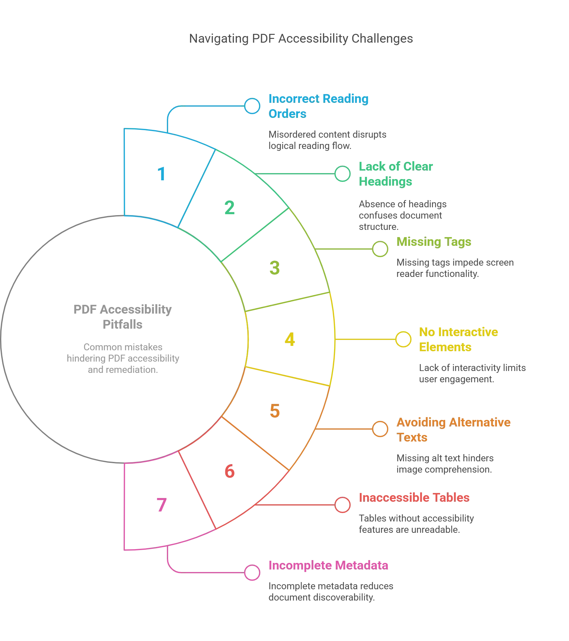
Here are seven common accessibility pitfalls to avoid when creating or remediating PDFs:
1. Having Incorrect Reading Orders
Would you like to read a story where the climax comes at the beginning of a recipe where the ingredients list appears after the instructions? Sounds ridiculous, right? Similarly, a PDF with an incorrect reading order is a nightmare for people relying on assistive technologies.
The tag tree determines the reading order in a PDF and dictates how content is presented. It controls the sequence in which screen readers vocalize the document. Errors in the order can turn clear information into nonsensical chaos.
Thus, ensuring a logical reading order is crucial for PDF accessibility. It is what differentiates a smooth and understandable experience for all users and a frustrating obstacle course for those with disabilities. Remediation plays a vital role in verifying and correcting the order to ensure that your PDF is accessible universally because clear communication transcends visual presentation.
2. Not Using Clear Headings
Reading a PDF without clear headings is like walking through a maze blindfolded. It is confusing and frustrating for readers, especially those relying on-screen reading tools. Headings are crucial roadmaps that guide readers through the document and help them find specific information easily.
Missing or inconsistent headings make it difficult for readers to follow the flow of ideas. Without proper headers, tables also become an incomprehensible jumble of data and numbers. Clear organization lends visual appeal to your PDF and ensures equal access to information.
An organized and consistent hierarchy, where H1 denotes the main title, H2 denotes main sections, and H3 denotes subsections, allows assistive technologies to announce headings and context accurately. Proper headings and well-defined tables are cornerstones of accessible PDFs that pave the way for a smooth and inclusive reading experience.
3. Not Adding Proper Tags
An untagged PDF can seem like a library with books stacked haphazardly and without labels in sight. PDF accessibility guidelines require PDFs to have a proper structure that divides the document to help screen readers and other assistive technologies navigate.
Violating this PDF accessibility guideline can inconvenience readers and lead to legal trouble. Several PDF remediation techniques help add and refine tags to ensure AT users access the document as smoothly as sighted readers.
While tagging is important, untagging or removing unnecessary elements that screen readers might misinterpret is crucial. Decorative borders or repetitive page numbers are irrelevant and cause distraction. Remediation increases document accessibility by creating a clutter-free experience for AT users.
Inadvertent selections during content tagging can make your content disappear. However, a layer rearrangement will restore your content. The content panel helps you locate the concealed elements and bring them to the forefront to ensure proper stacking order.
4. No Incorporation of Interactive Elements
Scanned PDFs present a significant accessibility hurdle because their image-based content remains opaque to screen readers. It hinders navigation and text search for users reliant on assistive technologies. Additionally, unmarked decorative elements can disrupt the reading flow by being erroneously announced by these tools.
Moreover, interactive elements like links and forms require proper descriptions. Without meticulous descriptions, assistive technology users remain unsure of their purpose and functionality, potentially encountering broken links or unclear form instructions.
A single non-compliant interactive element renders the entire document inaccessible. To ensure your document is inclusive, it is advisable to use a PDF compliance checker.
5. Avoiding Alternative Texts
Visual impairments pose a significant challenge with images in PDFs. Since screen readers rely on text, each image requires an accurate alternative text description.
Omitting Alt text leaves users unaware of the images and their intended meaning. Crafting compelling Alt text demands precision and specialized knowledge to convey the content while adhering to accessibility standards.
Avoid relying on automated Alt text generation because it often produces misleading or incomplete descriptions. Manually assigning concise yet comprehensive Alt texts ensures clarity and efficiency.
6. Not Ensuring Table Accessibility
Bookmarks in PDFs serve as vital navigational aids, especially for users with cognitive impairments. Without bookmarks, it is difficult to locate information within lengthy documents.
Similarly, clear table structures are crucial for users relying on AT. Unmarked headers, rows, and columns become incomprehensible and create confusion. While tables effectively present information, their format can corrupt the document or jumble the data order.
Avoid using tables for formatting because it hinders accessibility. If you use tables for data presentation, ensure adherence to accessibility guidelines. Mark cells that categorize entire rows or columns as headers and address other potential issues to guarantee an all-inclusive reading experience.
7. Not Providing Comprehensive Metadata
Metadata includes items like PDF titles, which provide valuable context for users who are accessing the document. Comprehensive metadata plays a crucial role in PDF accessibility.
An accurate title informs users of the content upfront to prevent confusion. Ensure that assistive technologies read the document title, not the filename, which can be cryptic and often lack descriptive clarity.
Furthermore, specify the document language to avoid rendering it inaccessible for users relying on language-specific AT. Consider including the author, subject, keywords, and a PDF accessibility testing indication.
Remediating an Inaccessible PDF
You can remediate an inaccessible PDF to make it worthwhile for impaired readers. Effective PDF Remediation Tools and processes help enhance PDF navigation to comply with standards.
PDFs are generated from multiple sources. Hence, a single remediation solution won’t apply to all. However, tools such as Adobe Acrobat Pro make the process manageable and expeditious with their different accessibility features.
The process should start with the source document in native file format. Desktop publishing software makes adding headings, structure tags, titles, tables, and alt texts easy. The document can then be later exported to PDF.
It is advisable not to edit, copy, print, or extract from existing PDFs. The existing security features can stay back, which may deny reading permissions to assistive technologies.
You can remediate an existing PDF by following the steps outlined below:
- Read through the PDF and convert complex, jargon-loaded language into simple, easy-to-understand form.
- Fragment the content and organize it under maximum possible headings and sub-headings.
- For each graphic or picture, add a relevant Alt text.
- Ensure that the text’s contrast for the background is sufficient for optimum readability.
- Minimize the use of colors to convey information.
- Reduce the quantum of the color mix as it can intimidate colorblind readers.
- Use lists and tables that are accessible.
- Insert bookmarks wherever possible.
- Specify the language of the PDF.
- Use attention-grabbing titles that are interesting to read and can communicate the context of the content.
- Accurately tag each PDF element.
- Set metadata and titles as and where required.
- Add captions to videos, visuals, non-textual content, and multi-media elements.
- Use a reputed PDF accessibility checking software to conduct audits and to ascertain if the most recent accessibility standards have been complied with.
The process of PDF remediation takes time and requires due diligence. However, it can be eased by using tools like Adobe Acrobat Pro, which has the ‘Action Wizard’ tool integrated into its menus.
Clicking on the ‘Make Accessible’ menu will prompt you to make the PDF file accessible. After each attempt, use a screen reader or other assistive technology to check if the PDF can be read and navigated easily.
Wrapping Up
Whether you are a professional in the design or publishing industry or an individual creating content for personal or educational purposes, it is crucial to prioritize accessibility to ensure that all users can access and understand your PDF documents, regardless of their abilities or disabilities.
Accessible PDFs help you steer clear of legal issues, foster inclusivity, and enrich UX for a larger audience.
By diligently addressing document remediation challenges, you can transform your PDFs into gateways of information accessible to all, irrespective of their visual impairments, cognitive differences, or motor limitations.
Hurix Digital can help you create, test, and fix the accessibility of your PDFs according to the PDF/UA standard, the WCAG 2.0 guidelines, and other compliance requirements. We can also provide you with a certificate of compliance and a detailed report of the accessibility issues and solutions for your PDFs.
To learn more about Hurix Digital and its services, contact us today.

Vice President – Digital Content Transformation. He is PMP, CSM, and CPACC certified and has 20+ years of experience in Project Management, Delivery Management, and managing the Offshore Development Centre (ODC).
