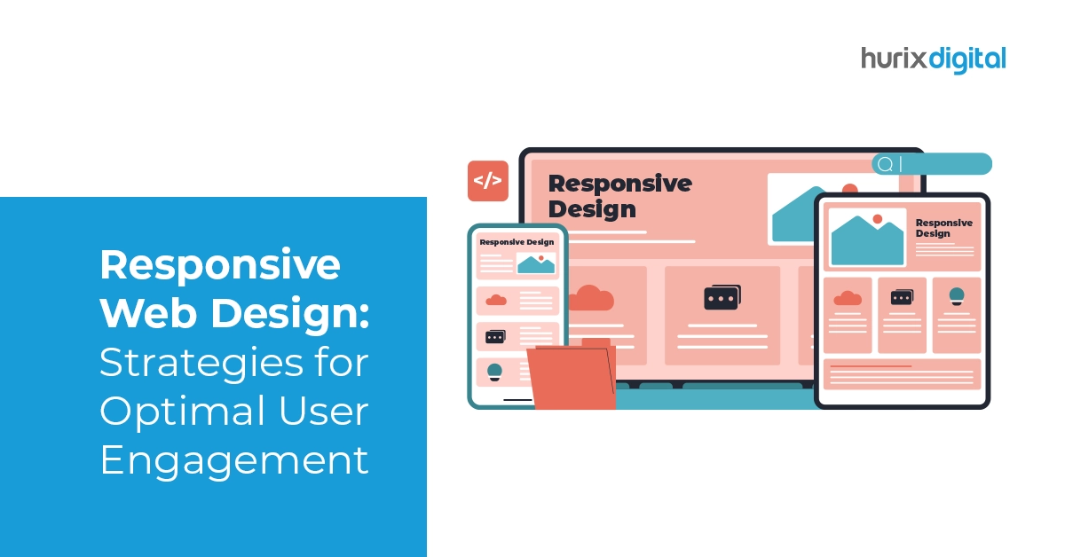
Responsive Web Design: Strategies for Optimal User Engagement
Responsive design is an important part of web development. In fact, studies show that you can get a 9,900% return on investment (ROI) by making responsive website design and user experience investments.
When a website design is responsive, it seamlessly adjusts to various screen sizes and devices, such as mobile phones, tablets, and computers. Achieving this adaptability involves employing a range of techniques that enhance the user experience and ensure accessibility.
Apart from this, aspect ratio, resolution, etc., must be adjusted to make a responsive design. One also has to pay attention to aspects such as flexible grids and layouts.
This article aims to explore these techniques comprehensively, ensuring both businesses and visitors benefit from an optimized web experience. Read on!
Table of Contents:
- What is Required for Responsive Web Design?
- What are the Main Elements of Responsive Design?
- How Can You Master Responsive Web Design?
- What are Some Important Considerations When Designing a Responsive Website?
- Final Words
What is Required for Responsive Web Design?
A responsive web design makes the website functional and accessible. It is important because it helps users easily access the website on any device and platform. There are many requirements for a responsive web design, but if the three main requirements are understood, then it becomes easy to create one.
Three main requirements are fluid grids, flexible images, and media queries.
- Fluid grids are required because they help the website automatically adjust according to the device and screen size.
- Similarly, by using flexible images, image loading becomes effortless. 39% of people get bored and leave a page when an image takes too long to load.
- Developers can write easy code by using media queries. Code is usually written in JavaScript or CSS. But by using media queries, custom formatting and functionality become easy.
What are the Main Elements of Responsive Design?
Responsive design primarily consists of three core components:
1. Query
This is the main part of responsive design. With the help of queries, developers can create different styles and layouts for different screen sizes. Usually, CSS is used for this. These provide custom styles so that different types of screen sizes can be targeted. Using media queries, the font size of images can be adjusted easily.
2. Browser
The browser is another important component with which users interact with the website. This element should be considered because, no matter what the device is, the user will always view the website using a browser.
Therefore, keeping the browser in mind, it is important to take elements that help define different images for different browsers into consideration. Whenever the browser window is resized according to the device, images and other website elements should also adjust accordingly.
3. Interface
When implemented properly, user interface (UI) designs can boost website conversion rates by 200%. This highlights why the user interface, or UI, is another important element.
The interface should adapt automatically to different screen resolutions and sizes. Fluid grids, media queries, and responsive images can create this type of interface. A responsive interface enhances the user experience and also helps in potential customer engagement.
Also Read: Website Development Trends You Need to Watch Out for in 2024
How Can You Master Responsive Web Design?
Responsive design dynamically changes the appearance of a website. It depends on the device orientation and screen size and responds accordingly.
Here’s how you can master responsive web design effectively:
1. Fluid Grid Consideration
Earlier websites mostly used pixel measurements. But nowadays, fluid grids are used in place of pixels. With the help of Fluid Grid, web elements can be easily set according to the screen size.
Therefore, it is very important to understand the fluid grid to make the best responsive design. A fluid grid is made of columns whose height and width are not fixed. That is why the proportion of the elements gets adjusted according to the screen size.
Due to the fluid grid’s flexibility, the website remains visually consistent on different devices, even if the device or screen size changes. Using a fluid grid also makes design-related decisions easy.
2. Typography
Usually, pixel font size is used on static websites, but it does not work on responsive websites. For responsive design, a responsive font is required.
This font should be easily adjustable and changeable so that the typography adjusts according to the screen size. Generally, in CSS3, this target is achieved by using the ‘rem’ unit; it helps in resetting the HTML font sizes according to the screen size.
3. Touch Screen Consideration
Nowadays, most devices, be it a table or a phone, use touch screens. Even laptops use touch screens these days. In such a situation, the responsive website will have to calibrate itself so that any touchscreen user can use it on any device.
The elements that appear big in the desktop view become difficult to detect on the mobile screen. What should be done in such a case?
Well, one solution is to use responsive images. Many modern tag attributes make the images responsive so that they can adjust to different screen resolutions on different devices. Apart from this, the videos should also be responsive; all this can be achieved by using the aspect ratio correctly.
4. Pre-Designed Layouts
Coding everything can be time-consuming, especially in the case of responsive design. That’s why many pre-designed themes provide responsive properties. For example, WordPress is one such website that provides many such options. These themes help developers quickly implement responsive designs without starting from scratch.
5. Use of Breakpoints
Breakpoints are the points at which the website adapts itself in a specific way. Breakpoints are important so that the content does not appear distorted on different devices. Breakpoints, which are used in responsive design, are also called CSS breakpoints. These are defined in the code. The website easily adjusts itself according to these points.
6. Testing on Real Devices
The final step is always testing. After doing all the coding and following all the processes, the website must be tested in real-world conditions as well.
After the design is complete, the website should be checked in a responsive design checker. Apart from this, many such tools are used so that one can check how the website will look on different devices.
What are Some Important Considerations When Designing a Responsive Website?
Here are some essential considerations you need to keep in mind when designing a responsive website:
- Screen size and resolution should be considered to guarantee that the website’s layout is consistent across devices and browsers.
- Important information and the content hierarchy should be simple to view and navigate across all screen sizes.
- Mobile-friendly navigation menus should have labels that are easy to read and understand. Compressing images and other media components can speed up load times and lessen page clutter.
- Touch device user experiences (such as touch-to-call or touch-to-email buttons) ought to be optimized.
- It is recommended to adhere to SEO standard practices, such as improving titles and meta descriptions for mobile search engines.
Additionally, make sure you consider the use of breakpoints effectively to ensure content displays optimally on different screen sizes. This will help you ensure that your website maintains a consistent and user-friendly experience across all devices.
Also Read: Essential Website Development Tools Every Developer Should Know
Final Words
Responsive website designs depend on the scope of any project.
Responsive design must use different capabilities for different types of users. This is primarily why it can be difficult to decide how to work with the elements or which service to choose from.
If you’re on the lookout for exceptional solutions to enhance your digital experiences, teaming up with Hurix Digital will help. Whether you aim to optimize for voice search, leverage AI and AR, or enhance accessibility and security, our team is ready to help you achieve your goals.
Contact our team now to learn more about our innovative automation solutions!

Currently serving as the Vice President of Technology Delivery Operations at HurixDigital, a prominent global provider of digital content and technology solutions for publishers, corporations, and educational institutions. With over 16 years of experience spanning EdTech and various domains, I hold certification as a SCRUM Product Owner (CSPO). My expertise includes operations, finance, and adept people management skills.


