10 Easy-to-Implement Steps to Improve Accessibility on Your Website
Summary
This post offers straightforward steps to enhance website accessibility. Learn practical techniques for making your site more inclusive and user-friendly.
Alright, so we all know the internet is connecting individuals worldwide for seamless information access, communication, and collaboration. But guess what? Not everyone gets to enjoy the digital playground the same way. Some folks, especially those with disabilities, face hurdles when surfing websites. That’s where accessibility steps in.
In this guide, we’re gonna walk through ten easy-peasy steps to amp up your website’s accessibility game. Let’s understand the world of accessibility with our Top 10 steps to make our website and applications accessible to everyone.
Table of Contents:
- Top 10 Steps to Make Your Website Accessible to Everyone
- Understand the Challenges of Disability
- Educate Yourself on Accessibility (WCAG ) Guidelines
- Apply a Simple and Consistent Layout
- Make Your Website Keyboard Accessible
- Provide Alternative Text for Images
- Provide Caption & Transcript for Videos
- Optimize Your Website Color Contrast
- Seamless Navigation on Your Website
- Design a Website for All Devices
- Test with Real Users
- Conclusion
Top 10 Steps to Make Your Website Accessible to Everyone
1. Understand the Challenges of Disability
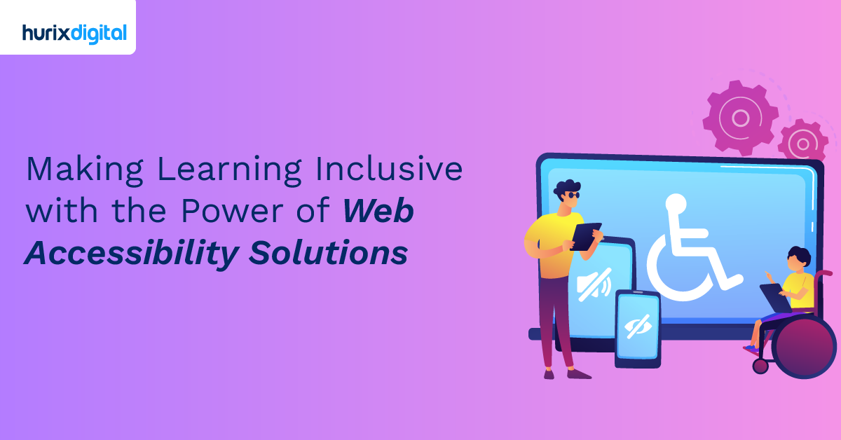
Understanding the challenges faced by individuals with disabilities is pivotal in our pursuit of true website accessibility. From navigating visual impairments to overcoming hearing limitations, dealing with mobility constraints, and addressing cognitive disabilities, each aspect requires a thoughtful approach. This deep comprehension acts as the driving force propelling us towards purposeful enhancements.
It’s not just about meeting checkboxes or following guidelines; it’s a commitment to crafting a digital landscape that prioritizes the diverse needs of our users. Delving into the intricacies of these challenges informs every decision, ensuring our design choices are intentional and genuinely cater to creating an inclusive online experience for everyone.
Also Read: Accessibility for Masses – Know How Hurix Digital Comes in
2. Educate Yourself on Accessibility (WCAG) Guidelines
WCAG (Web Content Accessibility Guidelines) thinks of it as the golden rulebook for making your website a breeze to use for everyone, regardless of abilities. WCAG serves as the roadmap to accessibility.
Some use screen readers, some navigate with keyboards, and others rely on adaptable text. WCAG guides us to make our website cater to this diverse landscape, making it a welcoming space for everyone. Beyond the user experience, there are legal and ethical dimensions to WCAG compliance. So make sure that your website is Perceivable, operable, understandable, and Robust for all users.
3. Apply a Simple and Consistent Layout
Why focus on a simple and consistent layout? Navigation is the highway of your website. Clear headings and straightforward menus make sure everyone can cruise through, no matter how they surf the web.
A simple and consistent layout benefits all users, especially those with cognitive disabilities. Ensure that the fonts used on your website are consistent and easily readable. Making thoughtful choices in font usage significantly contributes to a more accessible and user-friendly website.
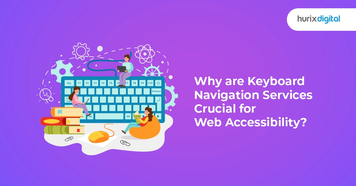
4. Make Your Website Keyboard Accessible
Picture this: keyboards aren’t just for typing; they’re lifelines for many navigating the digital content. From folks with disabilities to those who simply find it more efficient, keyboard accessibility is a game-changer. We’re not just ticking off boxes; we’re making sure every user, no matter their preferred method, can effortlessly dance through our website.
Think about someone with a motor disability or a visual impairment—they rely on keyboards to explore the digital universe. But it’s not just about overcoming challenges; it’s about embracing preferences. Power users love those swift keyboard shortcuts, and some just find it comfier than a mouse.
So, why dive into the world of keyboard accessibility? Because it’s not just about making our site inclusive; it’s about tailoring it to each visitor’s style. It’s like turning our website into a digital dance floor where everyone can groove to their preferred beat, keys or no keys.
5. Provide Alternative Text for Images
Ever wondered how images communicate, especially to those who can’t see them? Think of our site as a vibrant storybook – without alternative text, it’s like skipping over essential details in the narrative.
Without alternative text, it’s akin to a silent movie for users with visual impairments. But with thoughtful descriptions, it transforms into a complete, immersive experience. Incorporating alternative text isn’t merely a feature. It’s the main ingredient that makes the digital content truly come alive for a diverse audience.
And here’s a bonus – beyond inclusivity, adding alternative text gives our website a boost in search engine visibility.
6. Provide Caption & Transcript for Videos
Ever tried watching a movie on mute? Not the most thrilling experience, right? Now, picture those words running at the bottom of the screen when you’re watching a video. Those are captions – think of them as the cool cousins of subtitles. They don’t just repeat what’s spoken; they also describe the sounds, adding a whole new layer to the experience.
Captions and transcripts team up to make our videos accessible to a wider audience. So, let’s not just create videos; let’s craft stories that come alive for everyone, complete with captions, subtitles, and transcripts.
7. Optimize Your Website Color Contrast
In the realm of our website’s design, color is more than just visual appeal, why is color contrast so crucial?
You’re reading a web page where text and background colors meld seamlessly, creating a challenge in distinguishing between various elements. Optimized color contrast emerges as the solution, offering clear distinctions between foreground and background.
- Don’t rely on color alone for crucial information: Important information should not be conveyed through color alone. Consider additional cues like labels or symbols.
- Pick colors that play well together: Opt for colors that stand out distinctly from one another. This is particularly important for text against background colors.
- Follow accessibility guidelines: Ensure your color choices align with accessibility standards, considering factors like readability and user experience for individuals with visual impairments.
So, beyond aesthetics, color contrast is a practical tool that fosters inclusivity, making sure everyone can perceive the content easily.
8. Seamless Navigation on Your Website
Creating an accessible website involves thoughtful consideration of how hyperlinks are presented and utilized. These digital pathways play a crucial role in user navigation, and their design can significantly impact the overall accessibility of your site. Here are key considerations for enhancing the use of hyperlinks:
- Use clear and descriptive link labels.
- Integrate links seamlessly into relevant context.
- Maintain consistent styling for visual recognition.
- Leverage accessibility attributes like title or aria-label.
- Be mindful of link density to prevent overload.
- Regularly test links with diverse users for feedback.
- Ensure keyboard accessibility for seamless navigation
9. Design a Website for All Devices
Designing a website that seamlessly adapts to various devices is like giving it a superhero cape. Whether it’s a desktop or a smartphone, responsive design ensures your site looks fantastic on any screen.
- Mobile-Friendly Features: Being mobile-friendly goes beyond aesthetics; it’s about practicality. Large buttons and easily readable text make the mobile experience a warm welcome, catering to users on the go.
- Progressive Enhancement: Progressive enhancement is the secret sauce – providing a core experience for everyone and adding extra goodness for devices with more capabilities.
- User Experience Consistency: Consistency is key for user experience. Just like a well-organized store, maintaining a consistent look and feel across devices offers users a familiar map, ensuring they feel at home wherever they land.
- Cross-Browser Compatibility: Think of browsers as languages; everyone has their favorite. Cross-browser compatibility ensures your website speaks the same language on different platforms, acting as a reliable translator for crystal-clear content.
- Responsive Design: Designing with a device-friendly mindset isn’t just about opening doors; it’s about making a party accessible to everyone, regardless of the gadget they bring along.
10. Test with Real Users
It’s not enough to rely solely on guidelines and tools; involving real users with diverse abilities is key. Conduct usability testing with individuals who have disabilities to gather valuable feedback. This firsthand experience will highlight areas for improvement that might not be evident through automated tools.
Also Read: The Future of Accessibility Compliance in 2024: Emerging Technologies and Opportunities
Conclusion
So, there you have it – ten simple steps to sprinkle some magic dust on your website and make it a more inclusive space. Improving accessibility isn’t about checking boxes; it’s about making the web a cozy home for everyone, no matter their abilities.
As we journey into the future, let’s keep accessibility at the forefront. Small changes can lead to a big impact. Hurix Digital understands this and is championing the cause of accessibility with its expert services.
Let’s make the internet a place where everyone feels at home. Ready to dive in? Your website is about to become the coolest spot on the internet!

Vice President – Digital Content Transformation. He is PMP, CSM, and CPACC certified and has 20+ years of experience in Project Management, Delivery Management, and managing the Offshore Development Centre (ODC).
