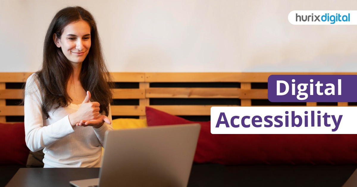
Why Do You Need Digital Accessibility?
Digital accessibility refers to technology being designed in such a way that it can be accessed by all users, regardless of their physical and intellectual capabilities. This includes electronic documents, websites, software, hardware, video, audio, and other digital assets. It is a diverse group that accesses technology and therefore it is crucial that technology be made available for everyone, including those with visual, hearing, neurological, motor, physical, and intellectual disabilities.
Digital accessibility services include but are not limited to web accessibility, audio accessibility, video accessibility, pdf accessibility, epub or ebook accessibility, image accessibility and mobile accessibility. The World Wide Web certainly has removed several barriers to communication and interaction that many people face in the physical world. However, when websites, applications, technologies, or tools are poorly designed, they in turn can create new barriers that could exclude people from using the Web.
Therefore, Digital Accessibility is essential for Quality assurance, developers and organizations that want to create high-quality websites and web tools and not exclude people from using their products and services. How is accessibility different from usability? While usability is concerned with whether the products are effective, efficient and satisfying to use, it does not specifically focus on the user experience of people with disabilities. Accessibility, on the other hand, is concerned with whether all users are able to access and get the same user-level experience when they use a product or service. Unlike usability, accessibility focuses on all users.
Why should we make digital accessibility a priority?
Digital accessibility ensures universal access to all: every website and application needs to be designed keeping this in mind. One of the important consequences of the pandemic is working from home: this automatically implies greater accessibility for everyone. The brand image of the company whose website is accessible by everyone will certainly stand apart from the rest. Greater accessibility means better user experience. More people accessing the website translates to a higher ranking in Search Engine Optimization (SEO). Legal expenses on account of lawsuits filed against companies whose websites are not accessible show a significant increase from 2019.
In many ways, be it legal to obligatory to compassion and concern, digital accessibility is increasing in significance. It is the right thing to do and it benefits not only those with impairments but all of us.
Web accessibility
Websites are an important part of Digital Accessibility, when websites are designed in such a way that people with disabilities can also use them, it means that the website is accessible or that there is web accessibility. It means that people can understand, navigate and interact with and through the website and contribute to the web.
Wikipedia defines web accessibility as an inclusive practice of ensuring that there are no barriers that prevent people with disabilities, physical or situational and those with socio-economic restrictions on bandwidth and speed, to access the websites.
All kinds/types of disabilities that affect access to the web are covered under web accessibility. These are:
- Visual
- Motor
- Auditory
- Speech
- Cognitive
- Neurological/Seizures
- Cognitive and intellectual
- Globally at least 2.2 billion people have a near or distance vision impairment
- According to the World Health Organization, an estimated 466 million people, or 6.1 percent of the entire world’s population, are deaf or hard of hearing
- According to the World Federation of the Deafblind, between 0.2% and 2% of the world’s population is deaf-blind
- It is estimated that between 1 – 3% of the global population, or about 200 million people, have an intellectual disability
- About 2% of adults have a seizure at some point in their life.
Web accessibility is all about social inclusion: it is not just for people with disabilities but also others such as older people, those in remote, rural areas and people in developing countries. And it is highly beneficial for business too. Accessible design improves the user experience and satisfaction, in a variety of situations, across different devices, and for older users. Thus, we find that accessibility enhances the brand, drives innovation, and extends the market reach.
Even people without disabilities benefit from web accessibility:
- People using mobile phones, and smart devices, such as smartwatches, and smart TVs, with small screens
- People in an environment with bright sunlight
- Older people with differing abilities as they are aging.
- Those with temporary disabilities, for example, a broken arm, or visually impaired due to broken or lost glasses
- People with a poor Internet connection
However, currently, the situation is such that many websites and tools are developed with accessibility barriers and are not usable by people with disabilities. In an age where the Internet is an important resource, be it for education, health or economy, it is equally important that all people have equal access to information. This is where web content accessibility legislations become relevant.
WCAG – Digital Accessibility
In 1999, the Web Accessibility Initiative (WAI), a project of the World Wide Web Consortium (W3C), developed and published the Web Content Accessibility Guidelines (WCAG) 1.0. On December 11, 2008, the WAI released the WCAG 2.0 as a Recommendation.
The goal of the WCAG 2.0 is to be up-to-date and more technology-neutral. The WCAG 2.0 have been generally accepted as the definitive guidelines on the way in which to create accessible websites. WCAG 2.0 is based on the four main guiding principles of accessibility represented by the acronym POUR: perceivable, operable, understandable, and robust, otherwise known as the POUR principles of accessibility.
POUR Principles of Digital Accessibility
Perceivable – For content to be perceivable, one must be able to perceive it through multiple senses. Converting non-textual content into text is most often the key to permeability, which can later be processed by the user’s assistive technology.
Bureau of Internet Accessibility points out the guidelines for perceivable as presented in the WCAG 2.1:
- Text Alternatives: Text alternatives to be provided for non-text content so that it can be altered into forms that people need, such as large print, braille, speech, symbols or simpler language.
- Time-based Media: Provide alternatives for time-based media.
- Adaptable: Creation of content that can be presented in different ways (for example, a simpler layout) without losing information or structure.
- Distinguishable: Making it easier for users to see and hear content including separating the foreground from the background.
Operable – Users use several different devices: web designers must be aware of these devices and enable the user interface components and navigation elements in a way that everyone can operate with it. For example, not limiting user input to only mouse or pointers but making it available to as many devices as possible like keyboard, voice recognition software, etc.
The Operable guidelines:
- Keyboard Accessible: Make all functionalities available/accessible from a keyboard.
- Enough Time: Provide users adequate time to read and use content.
- Seizures and Physical Reactions: Do not design content in ways that could cause seizures or physical reactions.
- Navigable: Provide help users navigate, find content, and determine where they are.
- Input Modalities: Make it simpler for users to operate functionality through various inputs beyond keyboard.
Understandable –A user has to understand what a website is about. This understanding relates to the consistency and ease of use of the navigation elements on a site; so it is vital to reduce the number of navigation elements and present them consistently throughout a website. This can improve usability for the blind, for those with cognitive or learning disabilities, and for the senior citizens. The guidelines are that it should be
- Readable,
- Predictable and
- With input assistance.
Robust – The content should be such that even as the technology and user agents evolve, the web content should remain accessible. Robust guideline is compatible: Maximize compatibility with current and future user agents, including assistive technologies.
The WCAG 2.1 was published on 5 June 2018. And, WCAG 2.2 is scheduled to be published by June 2022.
Protecting access to websites for those with disabilities by using the existing human or civil rights legislation is one method. The US for instance protects access for the disabled through the technology procurement process. Typically, nations support and adopt the WCAG 2.0 by referring to the guidelines in their legislation. In places such as North America, Europe, parts of South America, and parts of Asia, compliance with the WCAG is a legal requirement.
The accessibility of websites depends on the cooperation of several components such as:
- Content that comprises all the information in a web page or web application, including natural information (text, images, and sounds) and markup or code that defines the structure, presentation, etc.
- Media players, web browsers, and other “user agents”
- Assistive technologies like screen readers, alternative keyboards, switches, scanning software, etc.
- The knowledge of the users, their experiences, and in some cases, adaptive strategies employing the web
- Developers, including coders, designers, and authors, etc., as well as developers with disabilities and website users who contribute content
- Authoring tools such as software that creates websites
- Evaluation tools such as web accessibility evaluation tools, HTML validators, CSS validators, etc.
Examples of Digital Accessibility:
Here are a few examples of web accessibility.
While websites have illustrative graphics and images to add appeal to the website or perhaps to deliver a message, those visually impaired may not be able to view those images. In HTML, it is possible to display an alternative text if an image could not be viewed for some reason. This helps with visual impairments, which require assistive technologies to read web content.
In another case, those color blind may not be able to differentiate normal texts from the clickable links as they are similar to each other. This issue can be resolved by underlining the link text or creating a link button.
Some of the assistive technologies that individuals living with a disability use to enable and assist web browsing are:
- Screen reader software, used by blind/vision-impaired users
- Braille terminals, which has a refreshable braille display that renders text as braille characters
- Screen magnification software that enlarges what is displayed on the computer monitor for the visually impaired
- Speech recognition software is useful for those who have difficulty using a mouse or a keyboard.
- Keyboard overlays for those with motor control issues.
- Access to subtitled or sign-language videos for deaf people.
Web accessibility ensures that all sections of society can access the web and interact with it without any exclusion. And given the growing legal support and the significant benefits even for those who are not disabled point to the fact that web accessibility is here to stay.
PDF Accessibility
According to Commonlook.com, a Portable Document Format (PDF) is one of the most preferred formats because one can view, access and share information via a digital document that retains its attributes in terms of content, formatting etc. regardless of the device or the environment that is used to view it.
An accessible PDF is one that can be used/accessed by everyone, including people with disabilities such as those who are blind, visually or cognitively impaired or colour-blind. With an accessible PDF, it is easier for people with disabilities to access PDF documents with the aid of assistive technology software/devices, like screen readers, screen magnifiers, speech-recognition software, text-to-speech software, alternative input devices and refreshable Braille displays.
It is a common misconception that a tagged PDF is accessible but that is not true. Proper tagging is an important but not the sole aspect of an accessible PDF.
How do you know if a PDF is accessible?
If one is able to select parts of a text, as a few words or sentences, it is accessible. If not, then it is an image and hence not accessible. But here again, it is not the only point to ascertain the accessibility of the PDF.
Tagging should be checked too. Open the PDF document in Acrobat DC or Adobe Acrobat Pro and then, on the Navigation pane on the left, open the Tags panel. If the PDF document is not accessible, there won’t be any tags (or just one tag) available in the Tags panel. On the sidebar, in the physical view, if a number of tags appear, associated with content in the PDF document, and when you select any tag, if the connected content gets highlighted on the right side. This is an indication that the PDF is accessible.
Besides, there is a tool called PDF validators that help identify if a PDF is accessible. It is a special software tool that tests the PDF for different accessibility standards and verifies if it is accessible or not.
While it is possible for a PDF to be accessible without complying with the standards, it is the compliance with the standards such as WCAG 2.0, WCAG 2.1, HHS, and PDF/UA that makes it accessible to the largest possible audience.
Audio accessibility
The W3C of the Web Accessibility Initiative (WAI) describes accessibility considerations when planning, scripting, storyboarding, recording, and producing audio and video.
Some of the common accessibility barriers include lack of description of visual information for people who cannot view the video; requiring sight to understand the content of the video and lack of required contrast between the text and the background colours, making the text hard for some people to read.
It has provided specific guidelines for audio accessibility.
- Create high-quality audio: Record using high-quality microphone and recording software, in a room without hard flooring and away from all external sounds.
- Use low background audio: The background sounds should be at least 20 decibels lower than the foreground speech. Avoid sounds that are distracting or irritating.
- Speak clearly and slowly: This is for the benefit of those who want to understand content as well as for captioners and to make the timing better for sign language.
- Pause between topics for people to process the information.
- Use clear language: Avoid or explain jargon, acronyms and idioms.
- Provide redundancy for sensory characteristics: In the script, make the information work for those who cannot see and/or cannot hear. And, providing information using shape and/or location is an effective method which helps those with cognitive limitations.
Video Accessibility
W3.org provides the following guidelines for making videos accessible for all.
- Avoid causing seizures by avoiding anything that flashes more than three times in a period of one second.
- Consider speaker visibility: Ensure that the speaker’s face is visible in good light as it helps those who use mouth movement to understand spoken language.
- Make overlay text readable: Consider the font family, size and the contrast between the text and the background. Provide adequate contrast between text and its background in order that it can be read by those with moderately low vision.
- Plan for sign language: often sign languages are provided as an overlay in the bottom right corner of videos. Plan in a way that important information is not obstructed by sign language overlay.
- Plan for a description of visual information: Description is meant for the blind and those who cannot see the video well. It describes the visual information required to understand the content, including the text displayed in the video. One can either integrate description into the main audio content or record the audio and video with timing for accommodating a separate description.
- Integrate description: In the case of some videos such as presentations and instructional videos, integrate the content in the main audio itself. This is termed as “integrated description”. For example, instead of the speaker saying: As you can see on this chart, sales increased considerably from the first quarter to the second quarter, the speaker can say, This chart shows that sales increased significantly, from 2 million in the first quarter to 2.5 million in the second quarter. Another example would be: instead of the speaker saying, attach it to the pink end, the speaker can say: attach the small pin to the pink end, which is the larger end.
- Time for description: In the case of dramas, the description of the visual information and context is not a smooth affair in the main video. For those videos, the description needs to be separate. For short descriptions, space can be planned in the audio to add the description. But where it is longer, extra time can be recorded in the scene at the beginning or at the end, to accommodate the description without having to pause the scene.
Mobile accessibility
When you say that a mobile site or app is accessible, it means that it can be used by those persons with a disability, including those
- Who are visually impaired and use software that reads websites and apps out loud
- Who are hearing impaired who turn on captions when they watch videos
- Who have a hand tremor and use voice command software instead of their fingers to tap on the screen.
When coded correctly, mobiles websites and apps work for all of these people. But, typically, accessibility is not followed while coding mobile technology.
Levelaccess.com points out that assistive technology bridges the gap between a disabled person’s abilities and the content they wish to access. For instance, a blind person to use an iPhone through VoiceOver which reads content on screen. A layer of audio feedback helps the person navigate between apps and within apps.
Mobile accessibility is necessary as it is the right thing to do. Being inclusive socially, enabling equal access to the internet, the mobile, mobile apps and other technologies for those who are disabled is the proper thing to do. Also, mobile accessibility extends the reach of the market to include those who are disabled who make up 15% (1 billion) of the world’s population. When technology is sold via B2B or B2G, then accessibility conformance enables the product ranking to be higher. This ensures easier sale of products and services.
The principles guiding mobile accessibility are: Perceivable, Operable, Understandable and Robust.
Free tools are available to test if the mobile or mobile app is accessible. VoiceOver in ioS and TalkBack in Android are a couple of features that enable the blind to use their phones easily.
MDN WebDocs provides a checklist for accessibility of mobile app developers:
Colour: Colour contrast should comply with WCAG 2.1 AA level requirements. An adequate contrast between the font colour and the background preserves text legibility. The contrast ratio should be 4.5:1 for normal text and 3:1 ratio for large text (which is at least 18 points or 14 points in bold).
Allowing varying contrast ratios for larger text is useful as wider character strokes are easier to read at a lower contrast than narrower ones. This in turn allows designers greater leeway for contrast, which is useful for titles.
And all the information conveyed via colour should be made available by alternative means such as underlined text for links, etc.
While the WCAG’s general colour contrast ratios are appropriate for most users, mobile devices and applications need extra attention as they are more likely to be used outdoors, where they are facing the bright and glaring light of the sun. Therefore, using good contrast is vital for all users.
Visibility:
- Content hiding techniques such as zero opacity and off-screen placement should not be used exclusively to handle visibility.
- Especially for single-page apps with multiple cards, everything other than the current visible screen must be truly invisible.
Focus:
- Links and buttons are to be focusable by default while non-standard controls must have an ARIA role such as a button or link or checkbox assigned to them.
- And, the focus should be handled in a logical order, consistently.
Text equivalents:
- Text equivalents should be provided for every non-strictly presentational non-text element within the app.
- Images of text should be avoided.
- All user interface components with visible text as labels must have the same text available in the programmatic name of the component.
- All form controls must have labels to benefit screen reader users.
Handling state:
- The Operating System handles standard controls such as radio buttons and checkboxes but other custom controls state changes must be provided through ARIA states.
Orientation:
- The content should not be restricted to a single orientation such as landscape or portrait unless essential, such as a bank cheque.
Some critical factors while designing mobile apps are:
-
- Ease of data entry: Mobile devices and native applications allow users to enter data in various ways such as on-screen keyboard, Bluetooth keyboard, and speech. Text entry which can be tedious can be reduced by means of autofill, by providing select menus, radio buttons, or checkboxes. UsableNet points out that data sharing between apps or dictation of content greatly improves the overall experience of the app.
- Design for varying screen sizes: Mobile devices mean smaller screens and custom aspect ratios that designers need to account for while building native apps. A smaller screen means only a limited amount of information is available for people to take in at a time.
- A dedicated mobile website would be ideal to reduce the amount of information on each page (as compared to a laptop or desktop) or design the site responsively
- Minimize the need to zoom in by providing a reasonable default size for content and touch controls
- Adapt the length of link text to the viewport width
- Position form fields below, rather than beside, their labels
Touch targets
Multiple elements can be displayed together on a small screen with high resolution. So, it is important that these elements are large and distanced enough for being easy touch targets.
Best practices for touch target size include:
- Let touch targets be designed to be at least 9 mm high by 9 mm wide
- Add inactive space surrounding smaller touch targets
Interactive elements should be positioned in such a way that they are reachable regardless of how the mobile device is held. Developers should consider left- versus right-handed use, thumb range of motion etc. while designing the app so that what is easy for one user does not become difficult for another. Buttons need to be placed where they are easy to access.
Gestures should be simple
Gestures on touch-screen mobile devices include a one-finger tap or swipe as well as those that involve multiple fingers, multiple taps and drawn shapes. Simple gestures should replace complex ones to enable those with motor or dexterity impairment to use the device easily. In case of accidental clicking, users should be able to go back and correct their course.
Consistent layout and templates
Consistency should be maintained in placing components and navigational elements that are repeated across pages. If, for example, an application has a title, a logo, a navigation bar and a search form, appearing at the top of each page, these elements should appear in the same order and placement and even when the navigation bar collapses into a single icon when viewed in the portrait mode, then the drop-down should contain these elements in the same order.
Epub accessibility
According to AccessiblePublishing.ca, “An accessible EPUB file allows everyone to have access to its content in the way that they need. A file that is completely accessible offers the maximum flexibility of user experience for all readers, and ensuring that publications incorporate accessibility features will allow all readers to customize their own individual reading experience to suit their needs.”
“Having a digital product that can be used by a variety of reading applications and programs, and can adjust to a wide variety of screen sizes ensures that anyone can read the content, regardless of the device they choose or need to use.”
AccessiblePublishing.ca provides the best practices in accessibility publishing. Select issues and their best practices are cited as follows:
- Reflowable content: The first principle of accessibility is keeping inline styling out of the markup. However, fixed-layout books are typically used to project the appearance of a print book, sacrificing accessibility. But, EPUBs should have reflowable content when it comes to digital accessibility. This way, readers can adjust the font size, style, and color which is crucial for people with poor vision or dyslexia. People with print disabilities will have a superior quality reading experience. Fixed layout: Publishers should aim for inserting phrases instead of single words in span tags as it vastly improves readability.
- Structure: Modern semantic elements should be used to enable readers to rely on assistive technologies to navigate the content properly.
- Headings: Headings are used by readers who use assistive technology to get a feel for how the book is laid out, know when a new section begins, and navigate efficiently between sections. This is why a predictable structure of cascading headings is to be followed. In a book, level 1 headings should be used for major sections, such as chapters. Titles of subsections within chapters should be marked up with level 2 headings, and minor areas within a subsection should be highlighted with a level 3 heading.
- Single headings: When laying out titles, it is advisable to set up a single heading for the complete title of a section, with all text relating to one heading enclosed in a single set of heading tags.
- Images and Alt-text: It is important to provide descriptions in the alternative text HTML tag (alt=“ ”) attached to all images. The description should be an objective one that takes audience and context into account by using a neutral tone and language and first describing the image generally and then going into more specifics.
Tools to check conformance
To ensure a degree of quality of the accessible information in ebooks, the DAISY Consortium maintains Ace, the Accessibility Checker for EPUB.
-
Ace
The tool provides automated checking and reporting on a number of WCAG requirements. However, passing the Ace validation tool is not sufficient to claim conformance to the specification, since not all the WCAG requirements can be checked by a machine.
The other tool that the DAISY Consortium maintains to help check the conformance of EPUB publications is:
-
SMART
The SMART tool complements the Ace tool that helps evaluators in all the manual checks needed to ensure conformance to the accessibility specification.
Conclusion – Digital Accessibility
Creating an inclusive world is possible only if digital accessibility is available. At Hurix, we believe in equal access to online education, healthcare, and eCommerce for people with special needs. It also means equal access to friendship and growth in the age of social media. To know more about our Accessibility Solutions from HurixDigital, please write to us at marketing@hurix.com.