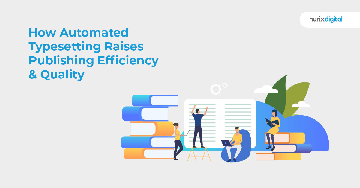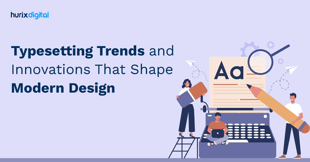
Typesetting Trends and Innovations That Shape Modern Design
Summary
Typesetting is arranging text and images to enhance readability, aesthetics, and impact. It plays a crucial role in digital and print media, influencing content engagement and credibility. Effective typesetting improves SEO, boosts traffic, and enhances user experience. This guide covers fonts, layout, hierarchy, and printing considerations.
Ever pondered the intricate process behind the seamless design of books, magazines, flyers, and posters? How is that ideal harmony between text and images, colors and fonts, spacing and alignment achieved? Enter – typesetting!
Typesetting is an essential skill for anyone who wants to create professional-looking documents, whether for print or digital media. It can make or break your message, your brand, and your audience’s impression of you.
Studies show that 48% of users say website design is the most important factor in determining a business’s credibility. This highlights the pivotal role of typesetting, as it significantly contributes to the overall aesthetics and credibility of content.
Typesetting is a crucial aspect of design that involves arranging text in a visually pleasing and readable manner. When designers choose fonts and arrange text nicely, reading is more enjoyable. Effective typesetting enhances the aesthetic appeal of written materials and improves readability and comprehension.
Writing has been one of the most fundamental forms of communication since the Cognitive Revolution. It traces its roots back to hieroglyphs or pictograms. Ancient civilizations used to draw images in caves to represent ideas and tell stories. These images soon evolved into alphabets, which later unfolded into various typesetting styles.
With the help of sophisticated word-processing software, typesetting has become relatively easy in this modern world. In this blog, we will learn about typesetting!
Table of Contents:
- What is Typesetting? Why is it Important?
- A Step-by-Step Guide for Typesetting
- How Typesetting Improves Content Engagement?
- How Typesetting Boosts Content ROI?
- How to Write Engaging Content with Typesetting?
- Graphic Design Trends You Can’t Miss!
- How to Choose the Best Typesetting Services and Tools?
- Conclusion
What is Typesetting? Why is it Important?
Typesetting is the art and science of arranging and formatting text and images on a page or a screen. It is a crucial step in the production of any printed or digital content, such as books, magazines, newspapers, websites, blogs, eBooks, presentations, and more.
Typesetting in Word is important because it affects your content’s readability, aesthetics, and impact. According to a study, users judge the visual appeal of a website in less than 50 milliseconds. If your content is poorly typeseted, it can create a negative impression and drive away potential customers.
On the other hand, if your content is well typeset, it can create a positive impression and attract more customers. First impressions of websites are 94% related to design. Typesetting can help you create visually appealing, easy-to-read, and memorable content.
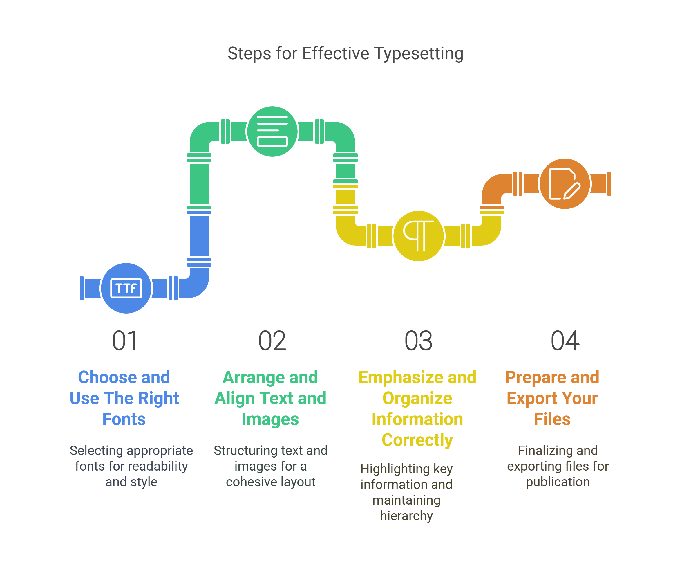
A Step-by-Step Guide for Typesetting
Here’s a step-by-step guide to mastering typesetting in four easy steps:
Step 1: Choose and Use The Right Fonts
Typography is the art and technique of using and manipulating fonts to create beautiful and effective text. Fonts are the visual representation of letters, numbers, symbols, and punctuation marks. They come in different shapes, sizes, styles, and weights, each with a personality and mood.
Font selection is one of the most important aspects of typesetting, as it can affect your content’s tone, mood, and meaning. Here are some tips on how to choose and use fonts for typesetting:
- Use fonts that match your purpose and audience. Use a serif font, for instance, if you produce a formal paper. It looks more refined and authoritative and has tiny strokes at the end of each letter. When composing an informal document, use a sans-serif font, which has no strokes and looks more contemporary and casual.
- Make sure the fonts are legible and readable. To ensure legibility and readability, use fonts that are clear, simple, and consistent, and avoid fonts that are too fancy, decorative, or distorted.
- Ensure that the fonts you choose are compatible and complementary. Use fonts with similar proportions, shapes, and styles, and avoid fonts that clash or compete. A good rule of thumb is to use no more than two or three fonts in a document – one font for headings and another for body text.
- Lastly, select appropriate and attractive fonts. Ensure appropriateness and attractiveness by using fonts that convey the right message, mood, and personality and avoiding boring, outdated, or offensive fonts.
Step 2: Arrange and Align Text and Images
Layout design is the process of organizing and positioning text and images on a page or screen to create a visually pleasing and functional composition. It involves using elements such as margins, columns, grids, alignment, and white space to create a harmonious and logical arrangement of text and images.
Layout design is essential because it affects how your audience scans and navigates your content. Here are some tips on how to arrange and align text and images for typesetting:
- Use margins to create a border around your content and separate it from the edges of the page or screen.
- Opt for columns to divide your content into vertical sections and to create a grid-like structure.
- Use grids to create a framework of horizontal and vertical lines that guide the placement and alignment of text and images.
- Utilize the alignment feature to position text and images along the edges or centers of margins, columns, and grids.
- Use white space to create empty areas between text and images and to create contrast and emphasis.
Step 3: Emphasize and Organize Information Correctly
Hierarchy is the process of creating a visual order and structure of information based on its importance and relevance. It involves using elements such as size, color, style, and position to distinguish and differentiate text and images. This is important because it affects how your audience perceives and understands your content.
Here are some tips on how to emphasize and organize hierarchy in typesetting:
- Make sure you choose the right size to create contrast and emphasis between text and images based on their importance and relevance.
- Opt for color to create contrast and emphasis between text and images based on their importance and relevance.
- Go for style to create contrast and emphasis between text and images based on their importance and relevance.
- Use position to create contrast and emphasis between text and images based on their importance and relevance.
Step 4: Prepare and Export Your Files
Printing considerations affect the quality and appearance of printed documents. They involve choosing and applying your files’ settings, formats, and specifications before sending them to the printer or the publisher.
It is important because print considerations affect how your content is reproduced and displayed on paper or other physical media.
Here’s how to prepare and export your files for printing:
- Use the right resolution for your images. The higher the resolution, the better the image quality.
- Use the right color mode for your images. Color mode is the way colors are represented and displayed on a device, and it is expressed in color models such as RGB (red, green, blue) or CMYK (cyan, magenta, yellow, black). RGB is the color mode for digital media, while CMYK is the color mode for print media. To ensure the right color mode for your images, use CMYK for printing and convert your images from RGB to CMYK before printing.
- Make sure your papers are in the appropriate file format. File format, represented by extensions like PDF (portable document format), DOC (document), or JPG (joint photographic experts group), is how data is encoded and stored in a file. PDF is the recommended file format for printing because it works with most printers and publishers and maintains your document’s layout, fonts, and graphics. Use PDF for printing and export your documents as PDF files before printing to guarantee the correct file format for your papers.
How Typesetting Improves Content Engagement?
Content engagement measures how your audience interacts with your content. It can include metrics such as page views, time spent, bounce rate, comments, shares, likes, and conversions.
Content engagement is important because it indicates how well your content resonates with your audience and how likely they are to take action.
Typesetting can improve content engagement by enhancing the following aspects of your content:
1. Readability
Typesetting can make your content easier to read and understand. By using a clear typography hierarchy, you can show the importance and relevance of your text elements.
This can help you organize your content, highlight your key points, and guide your readers through your message.
2. Aesthetics
Typesetting can make your content more appealing and professional by creating a harmonious layout, selecting suitable images and graphics, and applying a consistent style.
A well-designed layout can balance your text and images, create white space, and avoid clutter to create a seamless user experience.
3. Impact
With typesetting, you can enhance the impact of your content by making it more persuasive, memorable, and actionable. Among the key advantages of typesetting is the ability to craft an engaging headline, a compelling call-to-action, and a memorable logo.
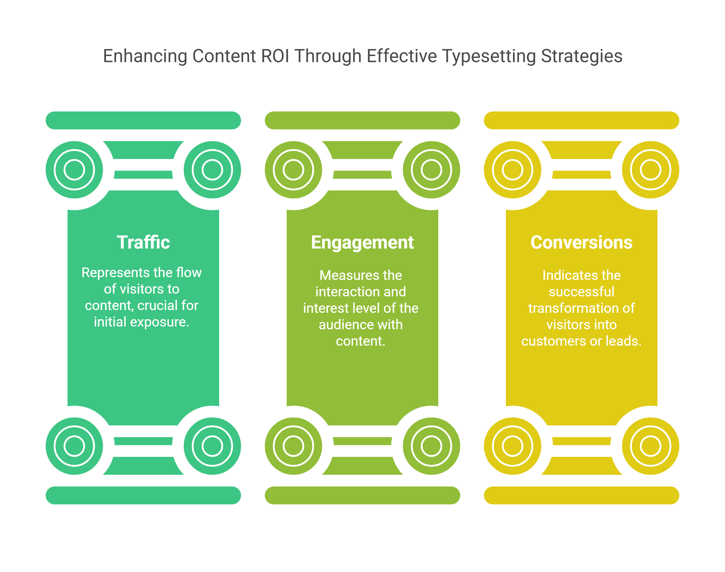
How Typesetting Boosts Content ROI?
Typesetting can boost content ROI by increasing the following outcomes of your content:
1. Traffic
The typesetting process can increase the traffic to a website or blog by improving its SEO ranking. SEO involves optimizing the content so it ranks higher on search engines.
Typesetting uses headings, subheadings, bullet points, and other formatting elements to improve SEO and create a clear structure and hierarchy of the content. Because of typesetting, search engines will be able to index and crawl the content more easily, and users will be able to find and click on it more easily.
2. Engagement
Typesetting rules can increase the audience’s engagement by making the content more attractive and enjoyable to read.
Typesetting can improve engagement by using fonts, colors, images, and other design elements to create a consistent and appealing style and tone of the content. This makes the content more appealing to the eye, more memorable, and more likely to elicit an emotional response from the audience.
3. Conversions
By using call-to-action buttons, icons, testimonials, and other persuasive elements, typesetting can improve conversions by presenting a clear and compelling message and value proposition of the content.
This makes the content more relevant, credible, and likely to motivate the audience to act.
How to Write Engaging Content with Typesetting?
You can use the following typesetting tips to write your content:
- Use a Clear Typography Hierarchy: To help your readers navigate your content, you can use different fonts, sizes, colors, and weights in the headings, subheadings, paragraphs, lists, quotes, and captions.
- Use a Pleasing Layout: Use a balanced and symmetrical layout for your text and images. This can help you create white space, avoid clutter, and create a harmonious and professional look for your content.
- Use Consistent Style: Make sure all your content is consistent in font and color. If you use bold for your subheadings, it should be bold throughout. This will allow you to establish your brand identity, build trust, and provide seamless functionality.
- Use Compelling Visuals: The images, graphics, and icons you use should be relevant, descriptive, and optimized for your content. This will aid in visual interest, support your message, and evoke emotions.
- Use Persuasive Language: To make your content more concise, clear, and effective, use contractions, idioms, transition words, interjections, and colloquial language. Avoid redundancy, repetition, and awkward phrasing.
Graphic Design Trends You Can’t Miss!
Graphic design constantly evolves, and staying updated with the latest trends is essential to keep your designs fresh and engaging. We’re seeing some exciting new styles emerge, each with its unique flair. Let’s explore some of the standout trends shaping graphic design:
- Liquified Designs: The most popular writing style currently includes a combination of realistic and abstract elements. These designs appear fluid, with undefined shapes, which works wonders for books based on surrealism.
- Iconographic: Not strictly adhering to traditional typography, these fonts are cheeky and fun. Their chaotic look affixs charm to your designs. Go for it if your genre is satire.
- Retro Condensed: Condensed typefaces are elusive. With their vibrant colors, they create bold and appealing designs. These work great for designing cover pages, posters, etc.
- Image Over Text: A trending design that many designers are using is images appearing over text. It works both, in print as well as digital media.
- Vintage: Get ready to travel back in time with a modern twist. Vintage aesthetics can be a great option for your period drama.
- Animation of Fonts: This is mainly useful for digital typesetting. Kinetic typography is steadily picking up as a trend to catch viewers’ attention. Its main purpose is to make the design more interactive.
- Highlighted Style of Lettering: Highlighting lettering is a comparatively new trend that will steadily increase. It emphasizes a particular message or element.
- Hand-Drawn Fonts: Hand-drawn fonts never go out of fashion. Amongst such fonts, those with rugged edges and bold strokes are especially sought after because add character and personality to any design. Their versatility shines through when paired with watercolor textures or foil accents, offering your projects a unique and handmade feel.
- Accessible Typesetting: Alongside modern design trends, accessible typesetting has become a crucial focus. Accessible typesetting means arranging text to make it easy for everyone to read and understand, especially for those who might have trouble reading, like people with poor eyesight or dyslexia. The goal is inclusivity for all readers.
How to Choose the Best Typesetting Services and Tools?
Here are some tips to help you choose the best typesetting services and tools for your business needs:
1. Know Your Needs
Do you need a simple typesetting tool for your blog or a complex typesetting service for your book? Do you need a free typesetting tool for your personal use or a premium typesetting service for your professional use?
Knowing your needs can help you narrow down your options and make a more informed decision.
2. Compare Your Options
You can use comparison websites, review websites, and forums to compare the features, benefits, and costs of different typesetting services and tools.
Use free trials, demos, and tutorials to test and evaluate different typesetting services and tools. Comparing your options can help you find the best service or tool for your needs, preferences, and budget.
3. Check the Credibility
Before finalizing a typesetting service or tool, check its credibility. You can check its ratings, reviews, credentials, certifications, and partnerships.
Checking the credibility can help you avoid scams, frauds, and low-quality services and tools.
4. Consider the Support
Check the customer service, technical support, and community support of the typesetting service or tool. The support can help you solve problems, learn new skills, and get the most out of your typesetting service or tool.
Conclusion
Typesetting is a skill that can help you create professional-looking documents, whether for print or digital media. It can also help you communicate your message effectively and create a positive impression on your audience. By following the steps and tips in this blog, you can master typesetting in no time and create stunning layouts that will impress your readers and clients.
For those seeking further insights into typesetting or requiring assistance with ongoing projects, Hurix Digital can help. We offer various typesetting services, such as e-book conversion, print-on-demand, XML conversion, and more. Hurix Digital has a team of expert typesetters, designers, and editors who can help you with your typesetting needs.
Get in touch with us to learn more!

Vice President – Digital Content Transformation. He is PMP, CSM, and CPACC certified and has 20+ years of experience in Project Management, Delivery Management, and managing the Offshore Development Centre (ODC).