5 Most Common Web Accessibility Issues to Avoid & Fix
Summary
Learn about the 5 most common web accessibility issues that organizations should avoid and fix to ensure compliance with accessibility standards and provide a better user experience.
Website accessibility allows users with physical or cognitive disabilities to access information online easily. Given that 15% of the world’s population are differently-abled, having an ADA-compliant (Americans with Disabilities Act, 1990) website ensures your content also reaches a large, untapped audience.
Table of Contents:
- What are Website Accessibility Issues?
- Why Should You Care About Website Accessibility Issues?
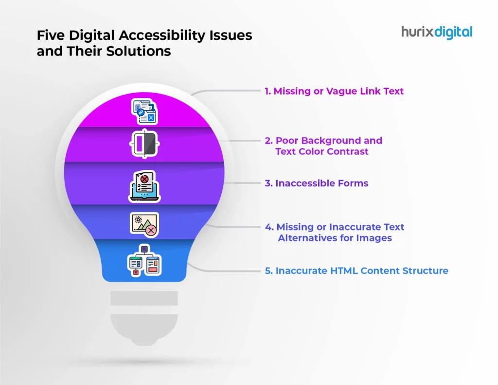
- 5 Digital Accessibility Issues and Their Solutions
1. Missing or Vague Link Text
2. Poor Background and Text Color Contrast
3. Inaccessible Forms
4. Missing or Inaccurate Text Alternatives for Images
5. Inaccurate HTML Content Structure - Wrapping Up!
But sadly, website accessibility solutions are often overlooked by many developers and website designers. It’s no wonder common accessibility errors, and issues are prevalent in the top 1 million web pages.
These accessibility issues create barriers for end users. This is not just ethically wrong but can also lead to significant bottom-line effects. Simply put, it can block many users from interacting with your business.
Before we dig deeper into accessibility issues and solutions, let’s brush up on the basics.
What are Website Accessibility Issues?
Web accessibility issues have “notable end-user impact.” In other words, they are barriers that make it impossible for differently-abled people to navigate, access, or engage with your site’s content.
Different types of impairments affect web navigation distinctively. To find out these issues, you’ll first have to understand how disabled people use websites.
For example, users with immobility in their arms depend on keyboard-only navigation as they cannot use a mouse. Other users with blindness or vision impairment rely on assistive technologies like screen readers to access websites.
Why Should You Care About Website Accessibility Issues?
- An accessibility-related lawsuit can be filed against your business if your website doesn’t adhere to the Web Content Accessibility Guidelines (violating WCAG website compliance).
- Accessibility issues limit the audience who can access your services or products. With a website accessibility checker, you can ensure that your website content reaches a wide range of users. This will broaden your target audience and potential market base, strengthening your brand image.
Also Read: How to Enhance User Experience for Web Accessibility Testing?
5 Digital Accessibility Issues and Their Solutions
1. Missing or Vague Link Text
Visually impaired users use screen readers to access website content. Links are critical elements that help users navigate sections while looking for particular content. The screen reader often only reads the link text without the words around it.
In such cases, displaying pointless or irrelevant link texts can confuse the users and restrict them from accessing the content correctly.
Using buttons or images to represent a link without any image alt text will also misguide the users, as assistive technologies cannot interpret any button or image functioning as a link in the absence of alt text.
Solution: Ensure that your link text communicates the purpose or function of the destination page. Instead of an ambiguous link text like ‘Click here’ or ‘Read more,’ provide an explanatory link text that’s easy to understand.
For example, if the destination page discusses hotels, your link text must be “Best hotels to stay” or “Top 10 hotels”. Also, add alt text to your images if you use images to represent links.
2. Poor Background and Text Color Contrast
With over 83% of home pages having low-contrast text, poor color contrast was the most commonly-detected accessibility issue per WebAIM’s programmatic analysis of 1 million web pages.
This makes it extremely difficult for users with color blindness or low vision to read the website content or identify the edges and shapes of elements.
Solution: Per the WCAG, the text and background colors must have a contrast ratio of 3:1 for large text and 4:5:1 for small text. Complying with this gold standard will make your website information accessible and readable to all.
You can also leverage a color contrast checker to ensure that your website’s background colors, text, and interactive elements feature the right color contrast ratio.
3. Inaccessible Forms
Users come across various form fields to fill out while navigating a website. But many online forms have empty or inappropriate form labels that don’t convey the intended control information to the screen readers.
This becomes an obstacle to visually impaired users who use assistive technologies to navigate and fill out the forms.
Solution: To make all input fields or contact forms on your website more user-friendly and accessible, ensure they have a clear label. In other words, use the <label> element in every field code. This will enable the screen reader to read it and convey what information a field requires to the user.
Also, make sure there are clear text alternatives for buttons and CAPTCHA so that users know what to click after finishing the form.
4. Missing or Inaccurate Text Alternatives for Images
WebAIM’s accessibility study in 2023 revealed that over 58% of the top 1 billion webpages have inaccurate or missing image alt text. Visually-impaired users who use screen readers rely on alt text to understand visual content. Having image alt text is the only way to translate the purpose of non-decorative images to them.
Solution: To help users understand informative images, include the right alt attributes or text alternatives to describe the visual content. Use the “ARIA-Label” attribute for background images having a separate tag.
Keep the alt text concise, explanatory, and relevant. You can skip the alt text for purely decorative images meant only for visual design.
5. Inaccurate HTML Content Structure
Screen readers, which help specially-abled users access a website, require an appropriate HTML page structure. Without headings, your content structure will look confusing and unorganized.
Using bold text rather than proper heading structure is a common web accessibility issue. This can frustrate users and adversely impact your SEO.
Solution: To make it easier for screen readers to navigate, ensure your headings have appropriate heading tags with subsequent subheadings in an organized way.
The right header elements include the main heading <h1>, heading 2 <h2>, and heading <h3>, etc., which benefits all website users.
Also Read: All You Need to Know to Ensure Web Accessibility
Wrapping Up!
Given the numerous accessibility guidelines, it’s natural for new developers to get overwhelmed while designing a website from scratch. Implementing the above changes in your web page design can go a long way in making your website more accessible.
Looking for help adhering to the accessibility guidelines and making your website inclusive? Hurix Digital is committed to making user-friendly web pages accessible to all. Contact us today to review your web page and learn about non-compliant documents or elements!

Vice President – Digital Content Transformation. He is PMP, CSM, and CPACC certified and has 20+ years of experience in Project Management, Delivery Management, and managing the Offshore Development Centre (ODC).
